In the digital age, the growth of traditional advertising, print, tv, radio—has stagnated with one notable exception. Out of home advertising (OOH), a catch-all term for billboards, transit wraps and point of sale signage is actually going gangbusters. According to the research firm, Magna Global, OOH spending grew 4.6% in 2018, a record high. But, of course, not every billboard campaign will yield record results for the brand. So how do you make sure your OOH money is spent wisely? Of course, a well thought out, efficient outdoor buy is crucial. But great placement with a boring, wordy, generic message is worthless. Consider these seven essential tips for an effective OOH campaign.
#1 — Strategy First
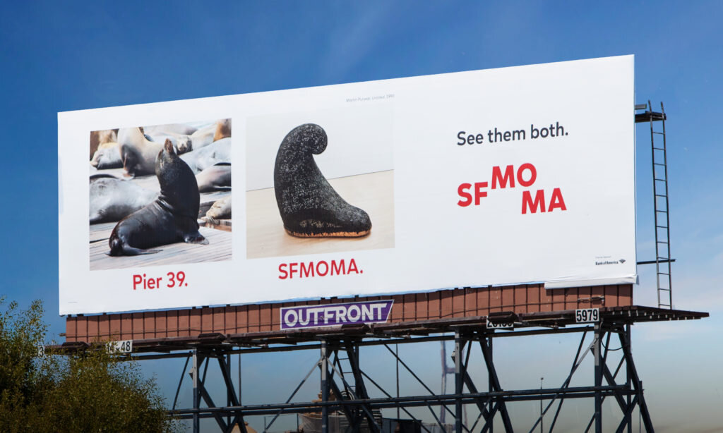
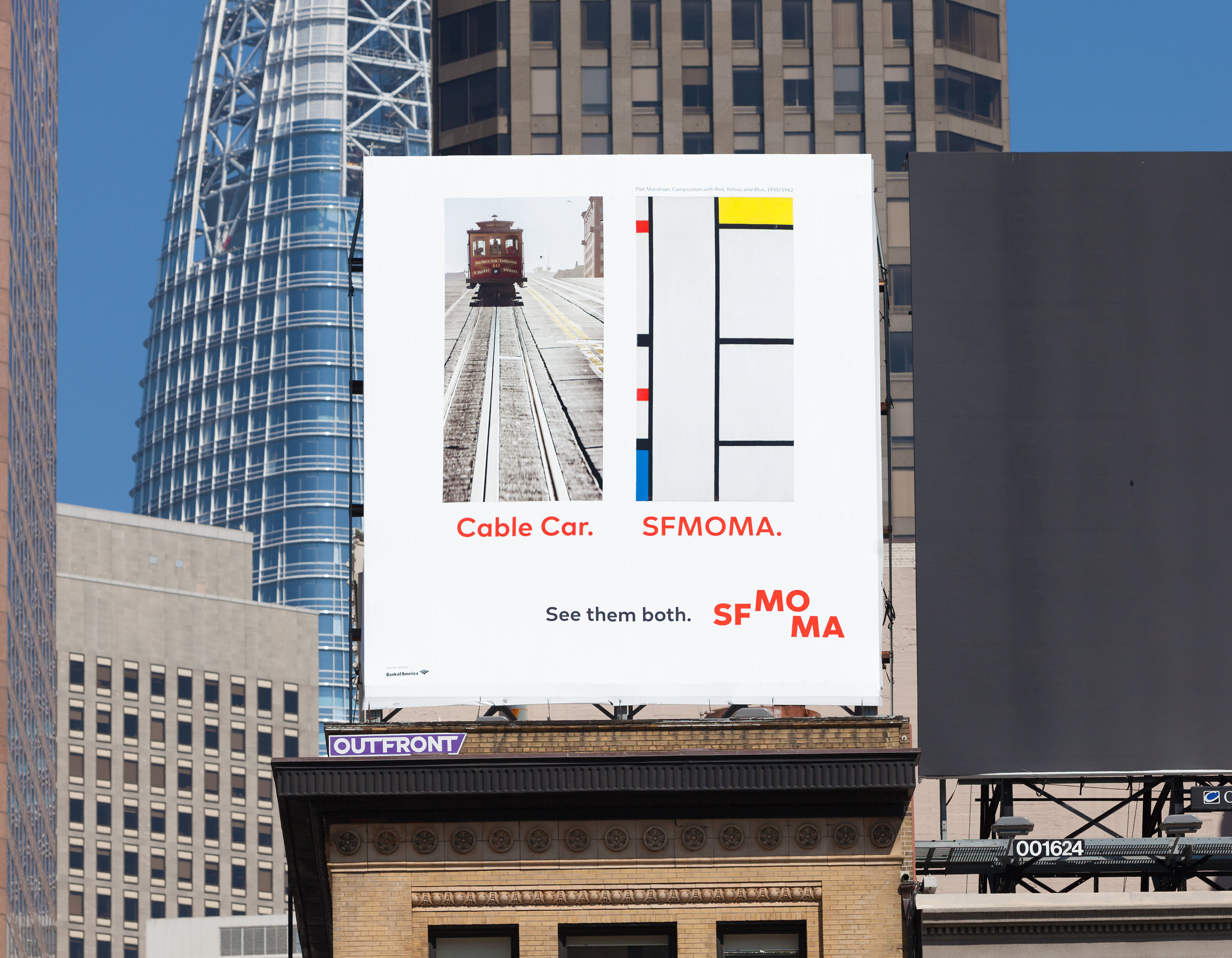
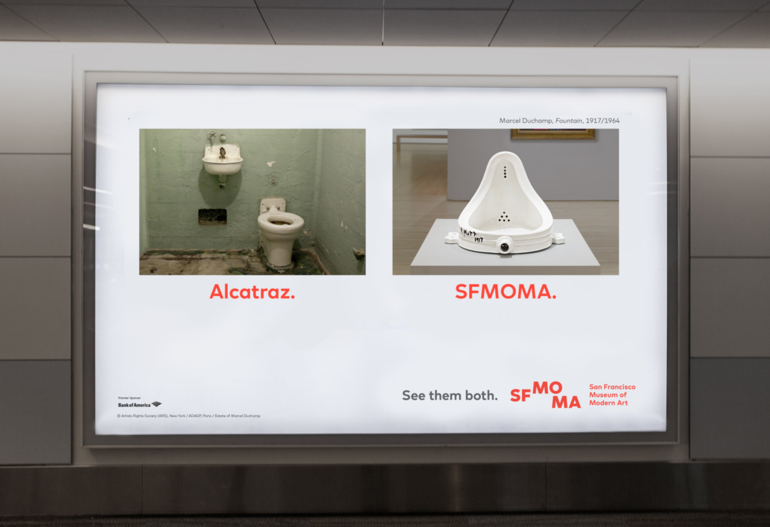
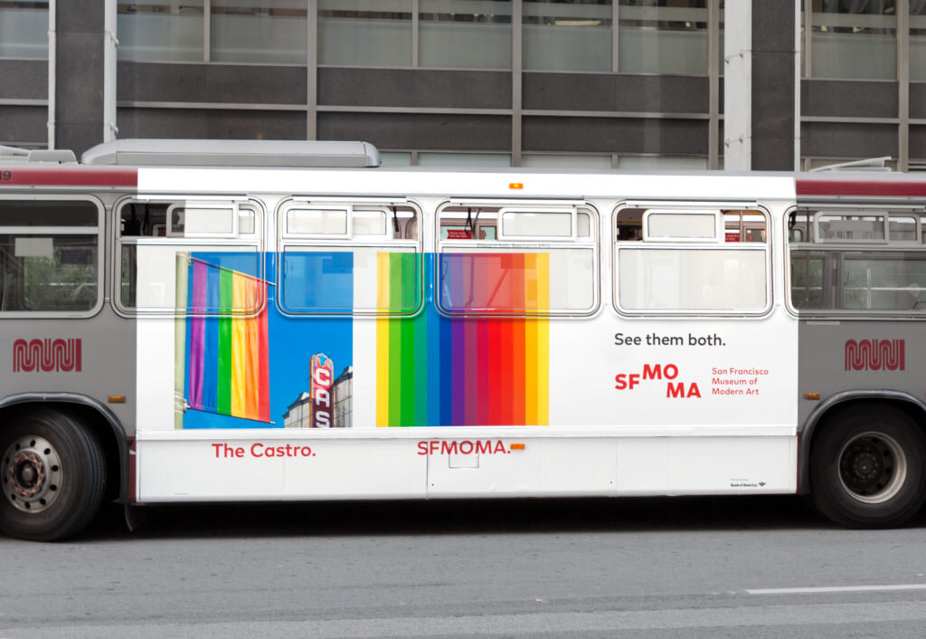
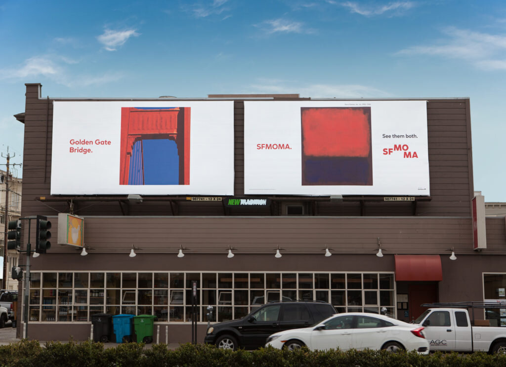
Start with honest, human insights. An outdoor campaign for the San Francisco Museum of Modern Art, for example, targeted visitors to the city. The assumption is that people use social media to plan their trips, research their destination and ask for recommendations. But research found that 85 percent of vacation itinerary decisions are actually made at the destination. This one statistic was the driving force behind the See Them Both campaign. Rather than compete with some of the more iconic tourist destinations, the museum chose to capitalize on their fame by promoting the museum alongside, Alcatraz, Fisherman’s Wharf, the Golden Gate Bridge and other bucket list faves. Following a three month campaign, museum traffic increased 48 percent while the average ticket sale increased 14 percent. So not just more people visiting the museum, more people spending more money.
# 2 — Put Google to Work
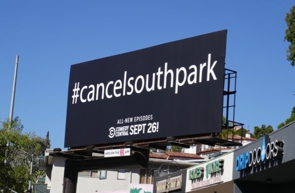
Don’t try to explain everything while someone is driving 60 miles an hour. Compel people to do their own research. Ninety percent of Americans are proficient with the same research tool that got you to this blog post. If they drive pass something intriguing on their commute, they’ll Google it. This approach proved successful for Comedy Central, which in 2018 ran an OOH campaign with messaging that read: #CancelSouthPark. Fans rushed to the internet for confirmation only to discover that it was the creators themselves pushing for the show demise, capitalizing on past viral Twitter campaigns which successfully saved the tv shows, Brooklyn Nine-Nine, and Lucifer both slated for the chopping block.
#3 — Invest in Multiple Executions
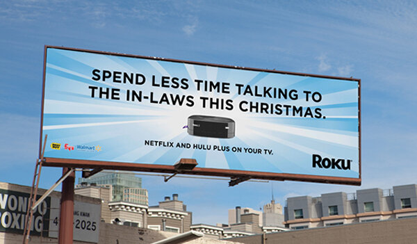
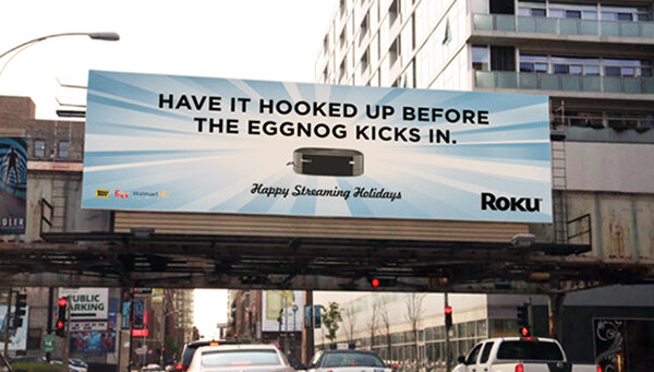
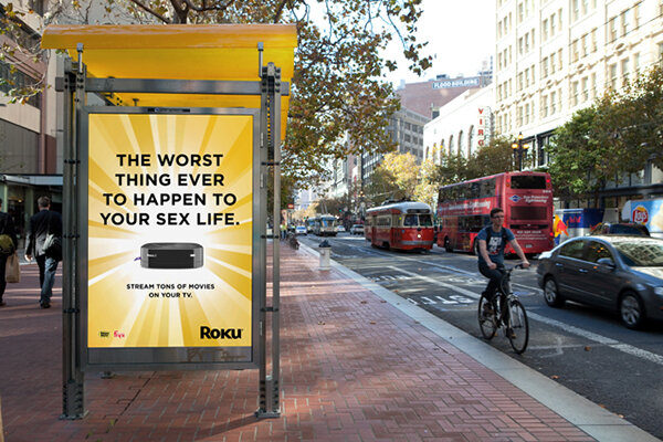
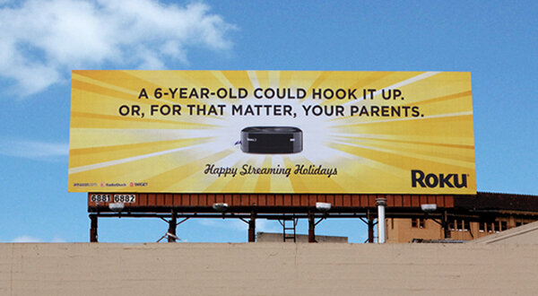
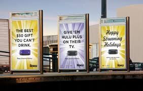
OOH is meant to build brand awareness. And the best way to do that is to stick with one unifying message and then create varied executions that people won’t get sick of. According to the 23 Below Media Group, Multiple OOH executions improve lasting impact by 14 percent thus extending the overall life of the advertising campaign. This was the strategy used to help launch Roku back when awareness of streaming was only at 7 percent. Despite being a superior product, they were having trouble stealing market share from brand leader Apple TV. Before we explained why our small, black box was better than the other small black box, we had to equate Roku with streaming so that when people did decide to jump into the streaming market, Roku would be top of mind. We blanketed communities with out-of-home messaging around the holidays that was funny and simple, but also varied. So it remained entertaining like the TV shows they love. By the time the campaign was over, we had established brand awareness on-par with Apple TV and increased Roku sales by 30 percent.
#4 — Give Them Something to Talk About
People hate boring advertising. They love things that are funny, compelling or worth talking about. And, of course, outdoor advertising needn’t be static. Just recently, for example, Kelly Services needed a digital video execution for the Times Square facing side of New York City’s landmark NASDAQ building. It’s a fabulous location in terms of eyeballs. But because there are 26 windows smattered throughout billboard it’s a design nightmare. Most companies ignore the windows, which then breaks up the type and makes the images look pretty crappy. But Kelly, a temporary staffing agency, incorporated the windows into their creative concept seizing on the adage: “Every time a door closes, a window opens.” In this way, the windows went from distraction to focal point and dovetailed with their overall brand message that no job is permanent. And because we knew the installation would turn heads, we even hired a production team to record people’s reactions when it went live in Time Square, which prolonged the life of the campaign by allowing it to proliferate on social media.
# 5 — Keep it Simple
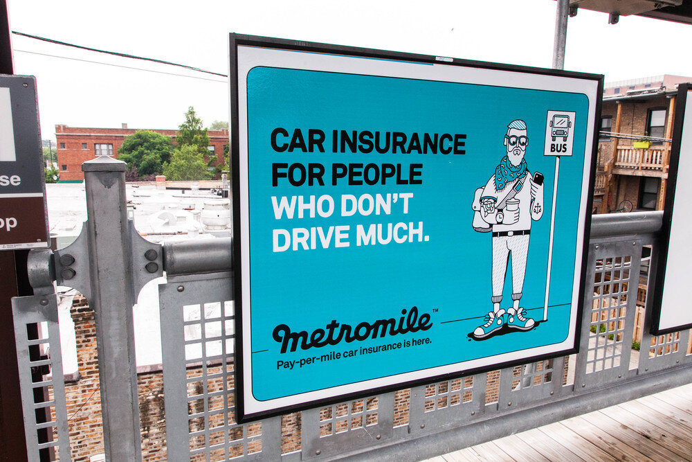
Less is more. We promise. Per research uncovered by 23 Below Media Group, OOH ads are 23 percent more likely to get noticed when they have fewer design elements. The billboard’s purpose is to build brand awareness. In the case of Metro Mile, for example, we cut right to the chase: Insurance for People Who Don’t Drive Much.” The message, coupled with a playful illustration, is a way to pique curiosity, not close a deal.
# — 6 Pay Attention to Placement
If a board or location is super cheap, there’s a reason. Is it behind a tree? In a bad part of town? Blocked by construction? Also essential: Pay attention to what’s being advertised on adjacent OOH real estate as it can negatively impact your brand. A billboard purchased by Burger King in Louisiana went viral, but for all the wrong reasons. The billboard was created to promote the fast-food giant’s meal deal—two sausage and cheese breakfast sandwiches for three dollars. Nothing provocative about it. However, it was placed alongside a billboard purchased by the American Heart Association (AHA) which read: One in three people will die from heart disease. No further explanation is necessary.
# 7 — Quit asking your agency to make the logo bigger
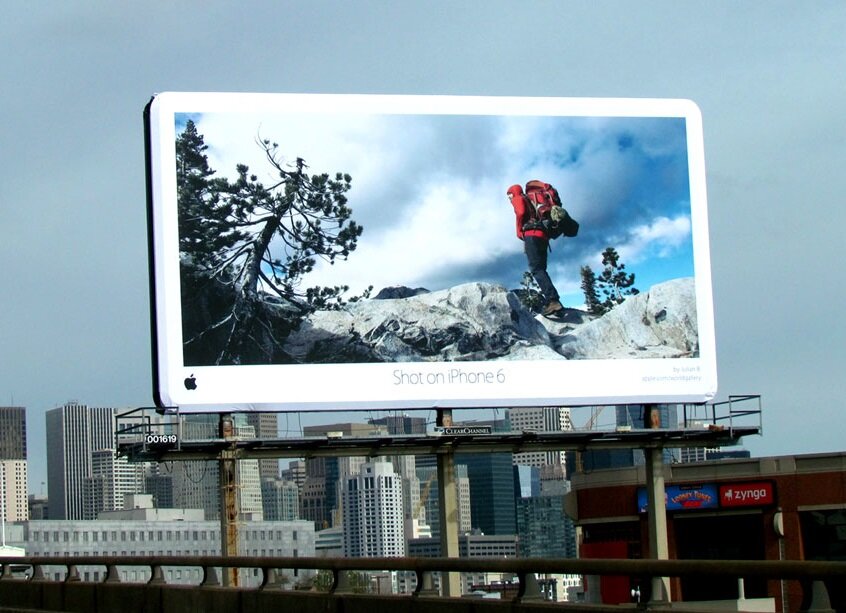
The logo should be visible, but not so visible it’s the first thing people see. No one gives a crap about your logo without a compelling idea. Give them a reason to WANT to know who is doing the message. If all you had to do was make the logo bigger, we would have done that years ago for all our clients and retired by now. Apple’s “Shot on iPhone campaign” embodies this approach. The company used crowdsourced photos shot with the iPhone to demonstrate the power of the product’s camera. The Apple logo is dropped quietly and tastefully into the lower left hand corner of each billboard.
####
The Small Agency Blog is produced by Division of Labor; a top San Francisco ad agency and digital marketing firm that’s been named Small Agency of the Year twice by Ad Age. The award-winning creative shop services clients on a retainer or project basis. They also offers brand consulting services and hourly engagements for startups and smaller brands. Click here for a free consultation.

