Division of Labor is an ad agency is San Francisco that specializes in working with startups and creating campaigns that utilize tech jargon to connect with an audience.
Five Tips to Perfect Your Advertising, Award Show Humblebrag
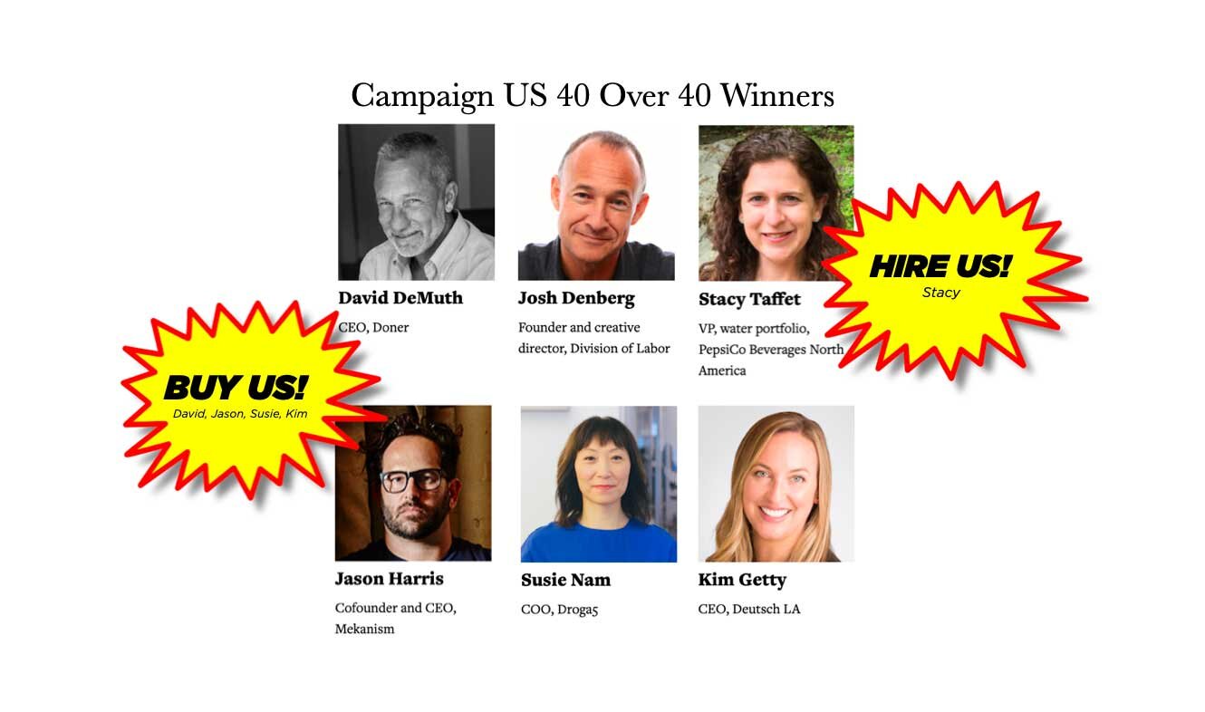
Photo Caption: Make sure your humblebrag sucks up to your co-honorees. Read on for details.
When it comes to smoke and mirrors the advertising industry is second only to magicians and illusionists. So it should come as no surprise, that no one has perfected the humblebrag like a seasoned ad executive. Nonetheless, in an industry glutted with self-congratulatory award shows, how can you make sure your ad exec humblebrag stands out from the competition?
Let’s say, for example, you run a boutique ad agency in San Francisco and you’ve won something kind of awesome, like, I don’t know. . . say . . . Campaign US’ Forty Over Forty award. Well, there are numerous ways one might approach the announcement of the said accolade.
No. 1 - The Simple, “Proud and Humbled”
The Proud and Humbled is the classic humblebrag and should accompany a link to the award announcement with a headline like, “Proud and humbled to be honored on Campaign US’ Magazine’s 40 over 40 list.” Variations include the “Surprised and Honored,” “Stunned but Thrilled. ” It’s, of course, also customary to post your humblebrag along with a picture from ten plus years ago creating the misimpression that you are not only successful, but also aging better than your colleagues. The beauty of the “Proud and Humbled” is the way it fits perfectly with the advertising industry’s ethos of being just barely half true. Because if you were actually humbled, you wouldn’t post anything at all.
No. 2 - The Self-Promotion with a Side of Suck-Up
This technique takes the simple “Proud and Humbled” a step further by also stroking the ego of a co-honoree who might further your career at some future date. If, for example, you’re the founder of a small, independent ad agency and would like nothing more than to get bought by a larger firm for gobs of money, switch up the wording a bit and suck-up to specific co-honorees with something like, “Proud and humbled to be honored on Campaign US’ 40 over 40 list, along with some of our industry’s greatest talents, including Kim Getty at Deutsch, Jason Harris at Mekanism and Susie Nam at Droga5.” Alternately, use the opportunity to brown-nose a potential new client with: “Proud and humbled, to be honored by Campaign US’ 40 over 40 list, alongside Stacy Taffet, VP of PepsiCo’s Water Portfolio.
No. 3 - Force Your Employees to announce It For You
Worried you’ll sound like a douche bag tooting your own horn? It’s easy to circumnavigate this problem and still get the publicity you crave and let’s face it, you deserve. As the boss, you can subtly suggest to your direct reports to use their social media feeds to promote your not-quite a Pulitzer accomplishment. (This method works particularly well during a pandemic when employees are scared shitless about losing their job.)
No. 4 - Pay an influencer
Why just force your employees to humblebrag for you when you can get complete strangers to do it for you? All you need is a few dollars and a true commitment to your ego. There are plenty of advertising blogs that would love to tell their readers about the Campaign US’, 40 over 40 honorees list, and every one of them will improve your SEO by adding backlinks and will give you an additional humblebrag opportunity to use your, “Thanks for the mention” humblebrag technique. Or, you could experiment with sites like Grin, Brandbassador, or Instagram and pay influencers to Tweet about you for a few thousand dollars. Ultimately, isn’t it really a fraction of what it probably costs you in entry fees to “win” your award to begin with?
Photo Caption: Make sure your humblebrag photo is from at least 10 years ago.
No. 5 Write a Self-Deprecating Blog Post to Mask Your True Intent
If you’re the founder of a small, ad agency and digital content studio, you could simply write a blog post about the art of the humblebrag never mentioning the fact that you are the one who has been chosen as a 2020 Campaign US 40 over 40 Honoree. If you go this route, it is important to wait until the very end of the blog post to combine all the techniques into one final line that says something like, “Hell yes, it’s about friggin time I got some recognition, Kim, Jason, Susie, we’re good and for sale. Stacy, how about a project? And everyone at Division of Labor, feel free to repost this blog, or you’re fired. And Campaign US, how about you post this? Do it and we’ll send you a deli basket from Zabars.”
###
The Small Agency Blog is produced by Division of Labor; a top San Francisco creative agency and digital marketing firm that’s been named Small Agency of the Year twice by Ad Age. The award-winning creative agency services clients on a retainer or project basis. They also offer freelance services and fixed-rate projects for startups and smaller brands.
How to get more foster parents in San Francisco
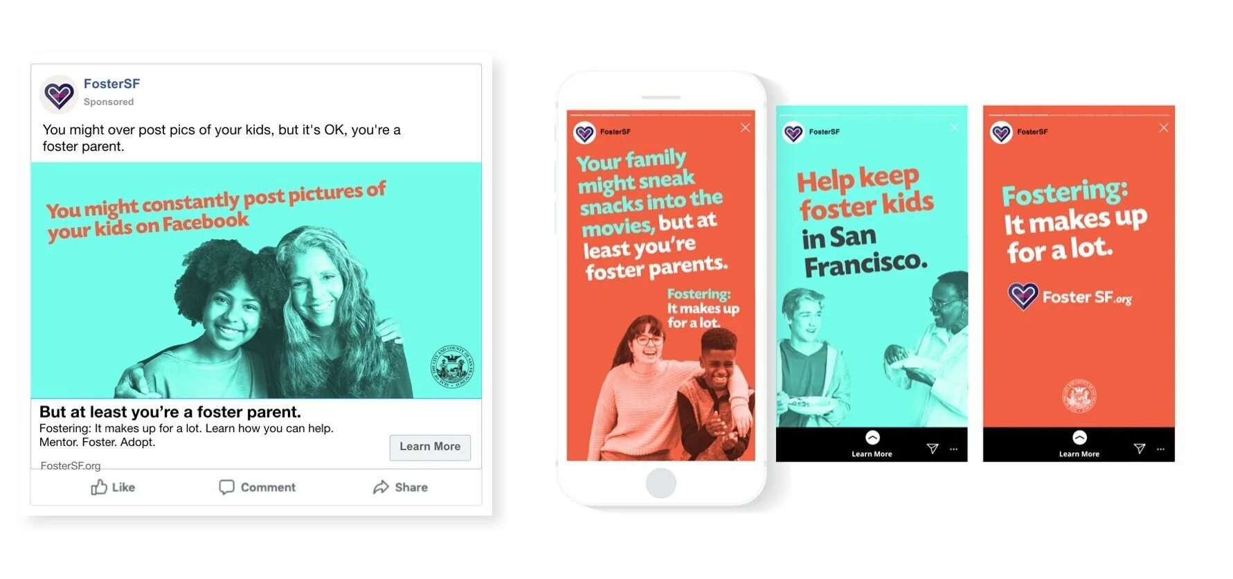
One of the many executions in a new campaign seeking foster families in San Francisco.
San Francisco’s housing crisis impacts everyone in the city, including long-time residents who can no longer afford rents and young families forced to move away to buy homes. But one of the under-reported tragedies: It’s also having a devastating effect on foster children.
Right now there are hundreds of kids waiting to be placed into homes in the city. And without a steady stream of volunteers, those kids will be forced into homes far from the only city they’ve ever known.
So how does a government agency get fresh recruits? They team up with one of San Francisco’s top ad agencies, Division of Labor.
The creative brief set forth by the San Francisco Human Services Agency was simple: Create an attention-grabbing ad campaign that recruits 100 new foster families to join the cause.
The ask is huge. It’s not like getting people to try a new laundry detergent or switch to a low-fat peanut butter. Becoming a foster parent is a life-changing decision. To that end, we needed an emotional hook that would get people to pay attention.
Inspiration hit while someone on our creative team was walking through a parking lot. He saw a huge SUV taking up two compact spaces. Not surprisingly, his first thought was: “What a jerk.” But his next thought was “Unless that jerk happens to be a foster parent. In that case, they can park wherever the heck they want!”
That idea really rang true with everyone on the project. It resulted in an edgier, more humorous campaign that changed people’s perspective on fostering and got them to think about it in a new way.
There are over 40 different executions across billboards, bus shelters, digital banners and social media platforms and they’re all based on the horrible, but not-so-horrible things we all do that can be made up for by being a foster parent. Things like, you might be a serial re-gifter or you might only tip 10% or you might eat all the m&m’s out of the trail mix, but at least you’re a foster parent. The tagline across the campaign: Fostering. It makes up for a lot.
The San Francisco Chronicle did a piece on the campaign launch, along with the perspective of a family who has fostered multiple kids over the years, including a medically-fragile baby they’ve since adopted.
And while ad agencies love free press, in this case, we’re hoping the free press attracts new families, not new clients.
#######
The Small Agency Blog is produced by Division of Labor; a top San Francisco ad agency and digital marketing firm that’s been named Small Agency of the Year twice by Ad Age. The award-winning creative shop services clients on a retainer or project basis. They also offer brand consulting services and hourly engagements for startups and smaller brands. Click here for a free consultation.
Ad Campaign Killed Following Feedback From CEO’s Wife’s Book Club.
Pictured above: Beth Clutterbuck’s Book Club eating chips, dip and passing judgement.
Production of a major advertising campaign was abruptly halted today following negative feedback from the CEO’s wife’s book club. Word came down at the start of day two of a three-day-shoot as the crew and ad agency gathered near the craft services truck to feast on breakfast burritos and kale smoothies.
The company’s CEO, Dwayne Clutterbuck, had just called with instructions to shut the commercial production down as a result of feedback he’d gotten from his wife Beth, and six others in her book club. Five of the six book club attendees had made negative comments about the advertising campaign after hearing it described by Ms. Clutterbuck while they were waiting for Margie and Dale to get back from the bathroom.
Clutterbuck’s company, Clean GreenTopia, had spent nearly four months, and invested more than $250,000 in consumer research for the ad campaign. But the random musings of six, mildly-intoxicated people who are not in the target market really made Clutterbuck rethink his marketing team’s approach.
“When you get a perspective of people that aren’t actually seeing the finished campaign but are reacting to one person’s third-party description of what she kind of remembers the campaign to be, you have to take it seriously,” said Clutterbuck.
The book club attendees spent a full 15 minutes dissecting Tara Westover’s best selling memoir, Educated, before conversation veered in another direction. “We were talking about her family’s tincture business, and this lead into a discussion of alternative wellness products, which then dissolved into us tearing apart Gwyneth Paltrow’s company Goop,” says Beth Clutterbuck.
Three of the dozens of titles kind of talked about, but mostly glossed over in Beth Clutterbuck’s book club.
“It really is a stupid name for a company. But it also lead us into a bigger discussion about corporate responsibility. And, well, that’s when I mentioned Dwayne’s new global ad campaign for organic bleach.”
Ms. Clutterbuck, initially gave the ad campaign idea the thumbs up, lauding its light-hearted and whimsical approach to dirty laundry. However, when she explained the premise to the book club, they weren’t having it. “There is no place for humor when you’re dealing with the destruction of the planet.” said Kathy Taylor who is currently unemployed but took some marketing classes in college. “Why would you make light of something as serious as global warming?” she asked seemingly unaware the advertising campaign has nothing to do with climate change.
After processing their feedback, Mr. Clutterbuck became concerned that the professionals he’d put on the project, who had nearly 500 years of marketing experience between them, just didn’t get it. “Sometimes you have to question people who do advertising and marketing campaigns for a living and go with the gut instincts of people who consistently offer opinions on things they know little about.”
The book club attendees, who meet quarterly, have two master's degrees in art history, a PHD in French cuisine and a certificate in canine grooming among them. Along with global marketing decisions, the group regularly advises the Clutterbucks on topics ranging from vacation destinations, gluten free restaurant options, or what to do when your child gets lice.
With regards to the latest digital marketing debacle, the group advised Clutterbuck to keep it simple. “Don’t waste time being clever or funny. When people want humor, they can watch a funny movie. When they want bleach, they just want to know how the manufacturing process affects our carbon footprint,” said Jill Friedlander, the one in the club that never bothers to read the book.
Anita Milton also voiced concern. “There’s too much money influencing our kids today. Corporations need to do a better job of focusing on responsible practices,” she explained without offering details on what her gripe has to do with a bleach commercial.
The one dissenter was Janelle Patterson. She actually thought the ad campaign was memorable and effective. “I thought it was hysterical,” says Patterson. “It made a boring product feel hip and cool.”
At press time, there were unconfirmed reports that Patterson would not be invited back for next quarter’s book, Where the Crawdads Sing.
#######
The Small Agency Blog is produced by Division of Labor; a top San Francisco ad agency and digital marketing firm that’s been named Small Agency of the Year twice by Ad Age. The award-winning creative shop services clients on a retainer or project basis. They also offer brand consulting services and hourly engagements for startups and smaller brands. Click here for a free consultation.
Cheap, Animated Cartoon used to Launch Billion Dollar Startup
Woo-Woo’s soon-to-launch explainer video looks nearly identical to every other explainer video out there. But the company notes their trademark “Boyyoyyong!” Sound effect is 37% more effective than traditional “Boyyoyyong!” sound effects.
After inviting four top San Francisco ad agencies to pitch for its business, Silicon Valley tech giant Woo-Woo changed course and instead contracted with 19-year-old Ben Clutterbuck, a Chico State sophomore who creates low-quality explainer videos with rudimentary cartoons and operates out of his dorm room.
Woo-Woo recently obtained nearly 100 million dollars in series B funding from four different venture capital firms and earmarked five million dollars for marketing and advertising. But after sitting in on the pitches, Woo-Woo’s most seasoned intern, Valerie Peabody, offered up an alternative approach. “The agencies were quoting costs of $300,000 to $5000,000 in creative fees alone,” notes Peabody. “And I thought, ‘that’s insane’ when my brother’s buddy, Dwayne could do the creative and production for, like, $500 bucks.”
Peabody arranged a SnapChat group so Clutterbuck could get to know the marketing team. After exchanging multiple dank memes, it became clear Clutterbuck understood Woo-Woo’s corporate culture exponentially better than any of the pitching agencies. “It wasn’t hard to see that crude animations and the occasional “Boyyoyyong!” sound effect would be just as effective as anything a full-service agency could produce,” says Woo-woo company spokesperson Victoria Pheferman.
Clutterbuck’s business model, which focuses on creating antiquated, two-dimensional style animations on the laptop his parents bought him, definitely appears to resonate with millennial tech executives who neither understand, nor value the complexity of an advertising and marketing strategy.
Clutterbuck, who runs his company out of the Royal Arms dorm-style apartment complex, says he’s stoked to be tapped. “This is lit,” Clutterbuck hooted. “Hundo P we will crush this.”
Woo-Woo, a Silicon Valley darling since late 2018, has developed an innovative, new, cloud-based, SaaS procurement optimization portal module. “The product has a universal appeal,” says Phefferman. “This kind of innovation practically sells itself.”
The bold decision to 86 the company’s marketing budget was ultimately approved by Woo-Woo’s senior management team, which, incidentally, consists of five 26-year-old virgins with zero business experience. “Every one of the guys in our c-suite is an Ivy League grad,” says Phefferman. What’s more, she notes: “Three of the five earned admission without bribes, fake athletic credentials, or cheating on their ACTs.”
And while the decision was a cost-cutting measure, it was also a change more in keeping with strategies at other large tech companies. “Our board said it was time to grow up a little,” says Phefferman. “And nothing says captain of industry like an animated explainer video with ukulele music.”
The explainer video will have a soft launch on the company website and will be tweeted out extensively on Clutterbuck’s social media feed. “I post all my client’s videos on my Instagram page. For an extra $20 bucks, I’ll even talk you up on my finsta page,’” says Clutterbuck.
####
The Small Agency Blog is produced by Division of Labor; a top San Francisco ad agency and digital marketing firm that’s been named Small Agency of the Year twice by Ad Age. The award-winning creative shop services clients on a retainer or project basis. They also offer brand consulting services and hourly engagements for startups and smaller brands. Click here for a free consultation.
Long before Nike, there was Krazy Kaplan
Division of Labor is closing up shop for the Fourth of July. Like most of you, we’re taking a break from brand launches, digital marketing campaigns, and media strategies to instead celebrate this country and our freedom.
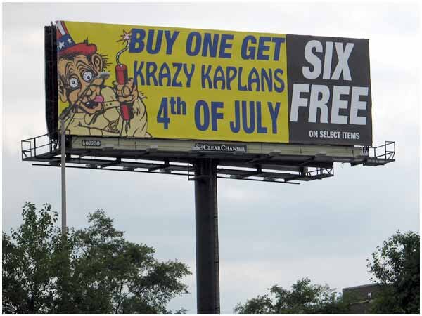
And as I will be traveling to the Midwest to spend time with family, it got me thinking about the face of the Fourth of July in the Midwest. Not Uncle Sam. Not a Yankee Doodle Dandy. But a deranged looking cartoon character called, Krazy Kaplan.
Krazy Kaplan Billboards line the highways of Illinois, Michigan and Indiana. And growing up, Krazy Kaplan got us kids all excited to blow our fingers off. Krazy Kaplan’s outdoor boards have endured for decades. Nothing clever. No smart writing or design and certainly Krazy Kaplan isn’t spending $700 per entry to try to win a Cannes Lion. But these sons of bitches have sure sold a lot of fireworks over the years. And while I can’t recall the names of any of my children’s grade school teachers, I sure as hell remember that Krazy Kaplans is conveniently located just across the Illinois border in Hammond, Indiana. And it’s the go-to store for all my fourth of July fireworks needs.
And it appears Krazy Kaplans has expanded their inventory since I was a kid. They now apply that same marketing strategy - buy one get six free - to their artillery shell selection. The maiming possibilities are endless. Happy Fourth of July to everyone. Take time off and savor the day.
####
The Small Agency Blog is produced by Division of Labor; a top San Francisco ad agency and digital marketing firm that’s been named Small Agency of the Year twice by Ad Age. The award-winning creative shop services clients on a retainer or project basis. They also offers brand consulting services and hourly engagements for startups and smaller brands. Click here for a free consultation.
Seven essential tips for an effective OOH campaign
In the digital age, the growth of traditional advertising, print, tv, radio—has stagnated with one notable exception. Out of home advertising (OOH), a catch-all term for billboards, transit wraps and point of sale signage is actually going gangbusters. According to the research firm, Magna Global, OOH spending grew 4.6% in 2018, a record high. But, of course, not every billboard campaign will yield record results for the brand. So how do you make sure your OOH money is spent wisely? Of course, a well thought out, efficient outdoor buy is crucial. But great placement with a boring, wordy, generic message is worthless. Consider these seven essential tips for an effective OOH campaign.
#1 — Strategy First
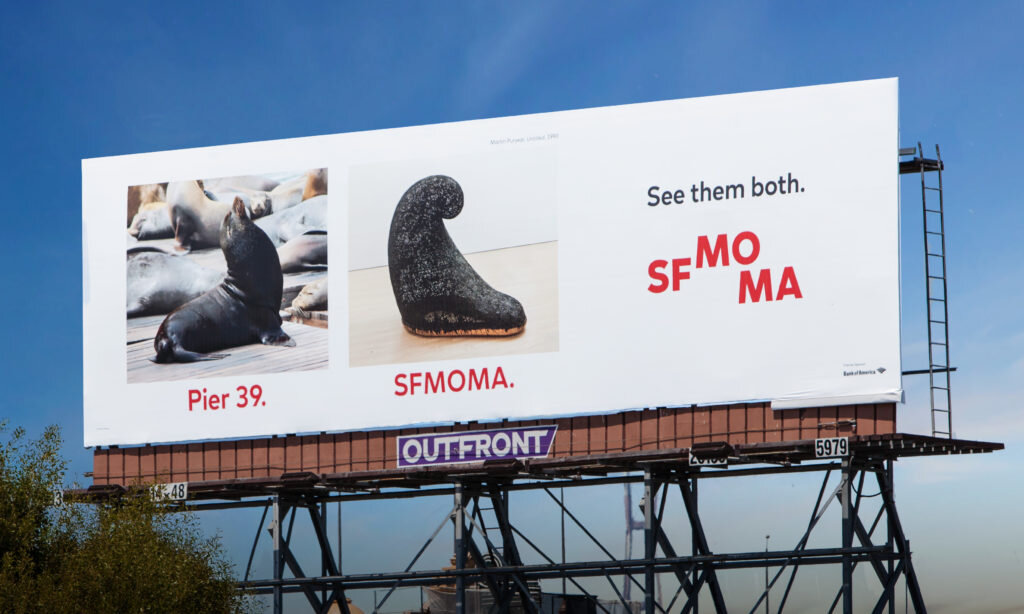
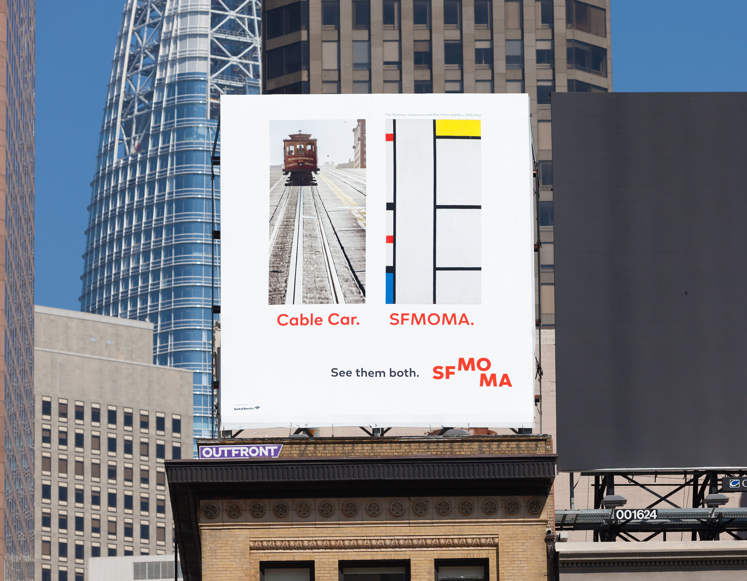
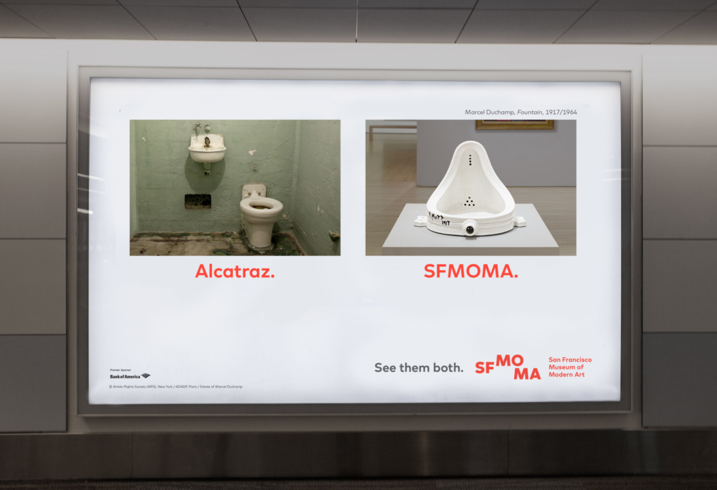
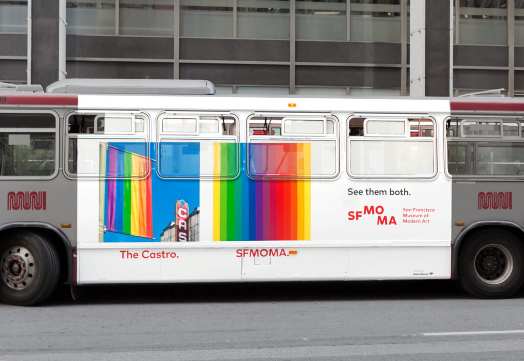
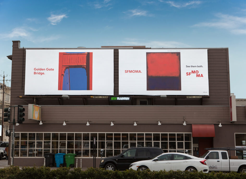
Start with honest, human insights. An outdoor campaign for the San Francisco Museum of Modern Art, for example, targeted visitors to the city. The assumption is that people use social media to plan their trips, research their destination and ask for recommendations. But research found that 85 percent of vacation itinerary decisions are actually made at the destination. This one statistic was the driving force behind the See Them Both campaign. Rather than compete with some of the more iconic tourist destinations, the museum chose to capitalize on their fame by promoting the museum alongside, Alcatraz, Fisherman’s Wharf, the Golden Gate Bridge and other bucket list faves. Following a three month campaign, museum traffic increased 48 percent while the average ticket sale increased 14 percent. So not just more people visiting the museum, more people spending more money.
# 2 — Put Google to Work
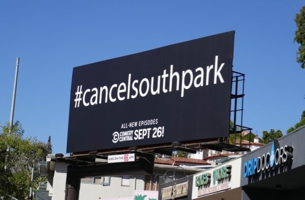
Don’t try to explain everything while someone is driving 60 miles an hour. Compel people to do their own research. Ninety percent of Americans are proficient with the same research tool that got you to this blog post. If they drive pass something intriguing on their commute, they’ll Google it. This approach proved successful for Comedy Central, which in 2018 ran an OOH campaign with messaging that read: #CancelSouthPark. Fans rushed to the internet for confirmation only to discover that it was the creators themselves pushing for the show demise, capitalizing on past viral Twitter campaigns which successfully saved the tv shows, Brooklyn Nine-Nine, and Lucifer both slated for the chopping block.
#3 — Invest in Multiple Executions

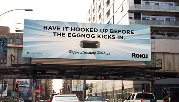
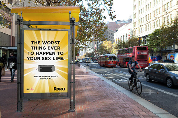
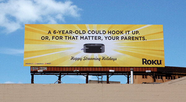
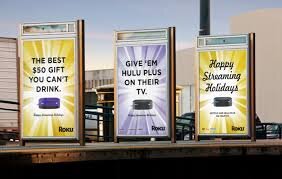
OOH is meant to build brand awareness. And the best way to do that is to stick with one unifying message and then create varied executions that people won’t get sick of. According to the 23 Below Media Group, Multiple OOH executions improve lasting impact by 14 percent thus extending the overall life of the advertising campaign. This was the strategy used to help launch Roku back when awareness of streaming was only at 7 percent. Despite being a superior product, they were having trouble stealing market share from brand leader Apple TV. Before we explained why our small, black box was better than the other small black box, we had to equate Roku with streaming so that when people did decide to jump into the streaming market, Roku would be top of mind. We blanketed communities with out-of-home messaging around the holidays that was funny and simple, but also varied. So it remained entertaining like the TV shows they love. By the time the campaign was over, we had established brand awareness on-par with Apple TV and increased Roku sales by 30 percent.
#4 — Give Them Something to Talk About
People hate boring advertising. They love things that are funny, compelling or worth talking about. And, of course, outdoor advertising needn’t be static. Just recently, for example, Kelly Services needed a digital video execution for the Times Square facing side of New York City’s landmark NASDAQ building. It’s a fabulous location in terms of eyeballs. But because there are 26 windows smattered throughout billboard it’s a design nightmare. Most companies ignore the windows, which then breaks up the type and makes the images look pretty crappy. But Kelly, a temporary staffing agency, incorporated the windows into their creative concept seizing on the adage: “Every time a door closes, a window opens.” In this way, the windows went from distraction to focal point and dovetailed with their overall brand message that no job is permanent. And because we knew the installation would turn heads, we even hired a production team to record people’s reactions when it went live in Time Square, which prolonged the life of the campaign by allowing it to proliferate on social media.
# 5 — Keep it Simple
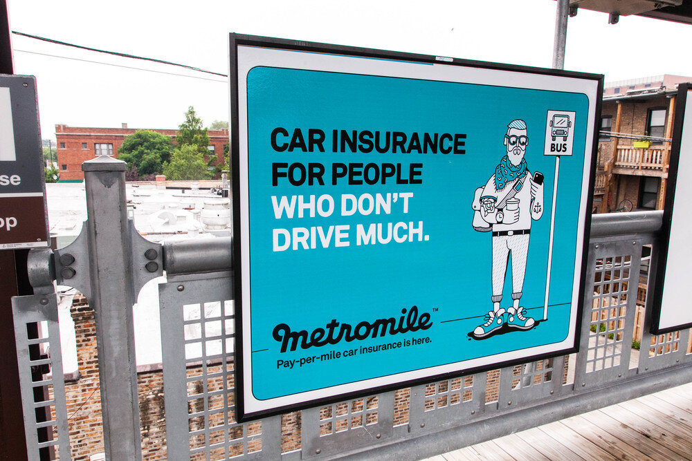
Less is more. We promise. Per research uncovered by 23 Below Media Group, OOH ads are 23 percent more likely to get noticed when they have fewer design elements. The billboard’s purpose is to build brand awareness. In the case of Metro Mile, for example, we cut right to the chase: Insurance for People Who Don’t Drive Much.” The message, coupled with a playful illustration, is a way to pique curiosity, not close a deal.
# — 6 Pay Attention to Placement
If a board or location is super cheap, there’s a reason. Is it behind a tree? In a bad part of town? Blocked by construction? Also essential: Pay attention to what’s being advertised on adjacent OOH real estate as it can negatively impact your brand. A billboard purchased by Burger King in Louisiana went viral, but for all the wrong reasons. The billboard was created to promote the fast-food giant’s meal deal—two sausage and cheese breakfast sandwiches for three dollars. Nothing provocative about it. However, it was placed alongside a billboard purchased by the American Heart Association (AHA) which read: One in three people will die from heart disease. No further explanation is necessary.
# 7 — Quit asking your agency to make the logo bigger
The logo should be visible, but not so visible it’s the first thing people see. No one gives a crap about your logo without a compelling idea. Give them a reason to WANT to know who is doing the message. If all you had to do was make the logo bigger, we would have done that years ago for all our clients and retired by now. Apple’s “Shot on iPhone campaign” embodies this approach. The company used crowdsourced photos shot with the iPhone to demonstrate the power of the product’s camera. The Apple logo is dropped quietly and tastefully into the lower left hand corner of each billboard.
####
The Small Agency Blog is produced by Division of Labor; a top San Francisco ad agency and digital marketing firm that’s been named Small Agency of the Year twice by Ad Age. The award-winning creative shop services clients on a retainer or project basis. They also offers brand consulting services and hourly engagements for startups and smaller brands. Click here for a free consultation.
Division of Labor Recognized on Clutch
Search Google for the top advertising agencies in San Francisco and there’s a good chance Division of Labor comes up toward the top of the listings, along with a company called Clutch. Clutch is a top provider of ratings and reviews for B2B service providers. Sort of like an aggregator or a matchmaker for business. Clutch uses data driven research to identify top firms in dozens of industries and categories, including ad agencies in San Francisco. And lately, we’ve been moving up the ranks on Clutch, sitting in the top 10 in a number of categories.
But how does Clutch actually determine its top 10 lists? Well, first their analysts conduct research on firms, considering factors such as marketing presence, company portfolios, and social media efforts. But most importantly, ranks are based on client reviews.
Several of our clients gave us detailed reviews of the work we completed for them. And, we’re happy to say, all who were interviewed (including the two below) gave us five stars. Reviews are conducted over the phone with Clutch analysts or online through a detailed questionnaire
“I loved their passion for creativity. They cared about my personal success and the success of my company.
- Former Director of Marketing, Roku
“They’re smart, and they get things done.”
- CMO, LA Marathon
In addition to our presence on Clutch, we are featured on their sister-site, The Manifest, as one of the top video production companies in San Francisco. The Manifest is a resource for firms of all shapes and sizes, offering curated industry advice and how-to guides to help identify and address all manner of challenges. Our inclusion was the result of our work, as well as the size of our team and the cost of our services, and we are grateful to be recognized for our production talents. But in the end, it all comes down to great clients and the partnerships we have with them.
Thank you to everyone on the Division of Labor team, as well as our amazing clients. Our next high-water mark: Recognition as one of the top 10 West Coast ad agencies. Stay tuned. We will let you know when that happens.
##
The Small Agency Blog is produced by Division of Labor; a top West Coast advertising agency and digital marketing firm that’s been named Small Agency of the Year twice by Ad Age. The award winning creative shop services clients on a retainer or project basis. And also offers brand consulting services and hourly engagements for startups and brands interested in testing new ideas, but who aren’t quite ready to invest in an integrated campaign or media spend. We can assist with brand strategy, brand voice, early-stage asset development, video creation and other communications to get things up and running without busting your budget. Click here for a free consultation.


